Mobile Responsive Design Demo
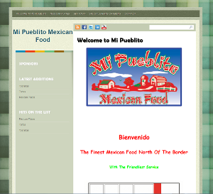
FULL SCREEN DESKTOP VIEW

So exactly what is a Mobile Optimized Responsive Web Design (RWD)? Here is a concise definition from Wikipedia: Responsive web design (RWD) is a web design approach aimed at crafting sites to provide an optimal viewing experience—easy reading and navigation with a minimum of resizing, panning, and scrolling—across a wide range of devices (from desktop computer monitors to mobile phones).
It’s important to note that an RWD site is an all in one site. There is no need for a separate mobile website and separate URL because the RWD site is totally optimized for both a full desktop as well as the smallest mobile phone.
Responsive Web Design RWD utilizes CSS media queries and multiple cascading style sheets to change the layout of the website. A responsive layout adapts to different viewing conditions depending on device orientation such as a tablet switching from landscape to portrait.
TABLET SCREEN VIEW

- TABLET VIEW
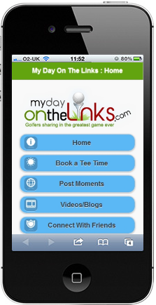
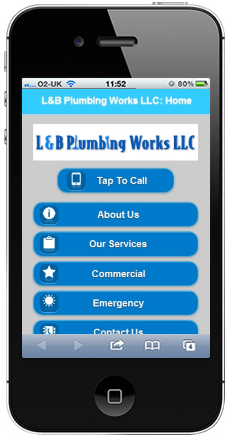
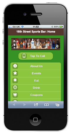
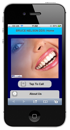
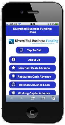
CELL PHONE SMALL SCREEN VIEW

The Mobile Responsive Design MRD solution may not be the best solution in all applications.
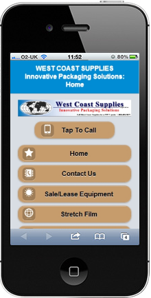
First consider what specific task you’d like to help your mobile visitors with.
For example, let’s say you are a fast food restaurant, car wash, lock smith, or some other type of service business. Your customer probably needs to access quickly for map location, hours of operation, pricing, and contact information.
You only need minimal information and few pages on your mobile site with a minimum in graphics.
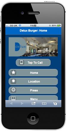
Here’s an example of a separate mobile site:
Unlike the Responsive Web Design RWD, the mobile site requires a separate URL (example: m.yourbusiness.com).
It is important to understand that the mobile site is a separate stand alone site. The main website (desktop version) requires no changes other than an auto redirect code (script) placed in the header.